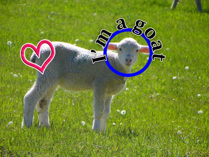
Goat
Syrup Label

In the 1950s-1960s it went from black and white to color. Most designs were focused on a vintage aspect. People were mostly happy or smiling in these ads or photos. Soon color came along and changed everything. Designs were mostly simple and really focused on the message they were trying to put out there.
In my logo I mixed the 1950s & the 1960s to get a little bit of both worlds. The picture of me was in black and white and the rest of the logo was all in color. I did this to show how ads progressed as time went by. I went with a more Holiday feel to keep the logo more a warm feeling and very greeting.
The tools I mostly used were the clipping mask tool, color adjustment, opacity, overlay, & duplicating. I didn’t really have any big challenges with this project except trying to get the message out there that it was a logo for a syrup company. I thought this logo was a success and it could actually be on a shelf at a store.
| peer_editing_brand_mascot.docx |
SBRHS Music LOGO